This blog is devoted to my architectural sketching adventures and musings about the integration of architecture and sketching.
I hope not only to share my own on-location architectural sketches but provide tips and methodologies for sketching and understanding architecture.
Also, most importantly, I wish to explore ways in which, in a digital age, we can not only defend but
promote freehand sketching within the architectural profession.

Friday, November 29, 2013

Sketching Architecture Wk 4 - Tone Colour and Texture


Final (4th) week of my sketching architecture class in the Rocks - looking at tone and colour. A lot to cover in one morning so I did an overview.

This week included:
1. how to map the light vs dark areas and then distinguish between what is shade and what is cast shadow.
2. How to get an arsenal together of standard watercolour mixes for architecture - I shared my favourite ones. And, as per my other classes this year, I showed how I like to work with juicy washes and often wet in wet - hitting it hard and leaving it.
3.  Texture - how to decide how much to include and options for line vs colour.

We then went outside to have some fun (and no perspective!)


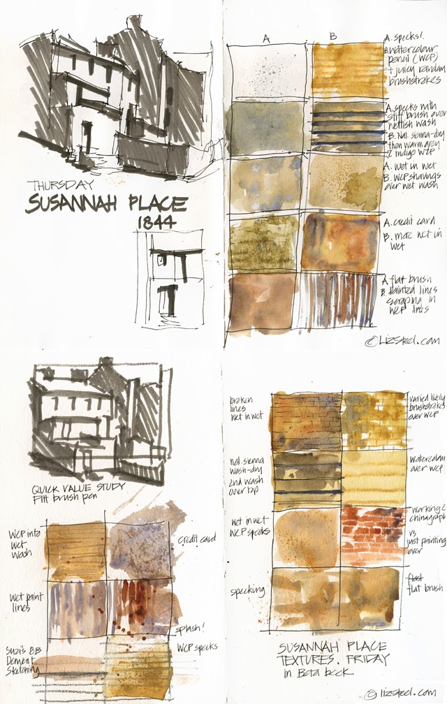
Thursday was a very warm sunny day. We headed to Susannah Place museum to look at the shadows and the textures of this historic collection of terrace houses. The sun moved quickly so we had to do value studies straight away and then had time to play with texture swatches. Trying to find areas in shade was a struggle and the security guard for the building we were using for shelter came to check what we were doing!


Friday was about 10C colder and raining…so not a great deal of tonal contrast visible but we still had fun exploring different ways to make textures with our watercolour and/or telling a story with one portion of the scene in front of us.


So much fun doing this course… and plan more in 2014.

Tomorrow I am doing a full day workshop summarising the content of this 4 week course- It will be a lot of fun whatever the Sydney weather is doing!

Thanks to everyone that we part of the class either on Thursday or Friday... what a keen and inspiring bunch of sketchers and it was a privilege to be able to share my approach to sketching architecture with you.

Friday, November 22, 2013

Sketching Architecture Week 3: Perspective


This week was the big week!

Yes, I was teaching perspective in my Sketching Architecture classes in the Rocks. (this is a little doodle sketch I did during the class to show the main setup for our subject)

Based once again in our wonderful classroom in the Tea Cosy, we started doing some line exercises - looking at ways to draw some typical patterns that we see in buildings out on location. Some of these are tricks I have picked up from one drawing lesson I had in 2nd year of my architecture course. Some of these are included in James Richard's wonderful book "Freehand Drawing and Discovery".


We then did a paper exercise with a photo before hitting the streets to draw a beautiful crisp sandstone warehouse. Both days we had very strong wind gusts to cope with as well and 'perspective lines'.

It is hard to find good examples of simple buildings on corners with good light and with shade on the other side of the street…so you can imagine how excited I was to find this! Everyone in the class learnt lots during the process of sketching this building and I think the results are amazing both days are. Many of the techniques were tested by trial and error!


It would require a number of very long blog posts to explain everything I shared this week but in essence I see perspective as a tool to set out the main framework for a sketch. Getting too technical, getting caught up in positioning all the lines perfectly, doing too much measuring and/or using a ruler kills the JOY of sketching for me. There are many wonderful artists out there who can achieve perfect perspective - but I am not one of them and am not trying to be.


So here are a few of my ideas:
(I am not sure how much of it will make sense in bullet point- but hopefully you might be able to glean some things from it.)

- perspective guidelines are used for setting the main elements - but you need to be able to first work out what the main elements of the building are!
- Use perspective to constrain out of whack or wonky lines but don't stress about wavy lines  (ie. small variations in the details are ok - they add life to the sketch - but try to keep the overall as 'right' as possible)
- eyeline (or horizon) is king! Everything is horizontal on the eyeline. This is a very powerful tool for sketching whether using perspective or not. It is the datum point that I use to locate all elements in my page. 'Hang' people off the eyeline.
- Develop the ability to be able to draw evenly converging lines. This is one of the most important drawing skills to have...as well as being able to review what is on the page and see if it is consistent.
- Don't need vanishing points! See this old post for my vanishing point-less approach to perspective and an amazing discussion on flickr . I still use Vanishing points, but don't stress if they are off the page.
- The importance of the VIP - my term for the Very Important Perpendicular. This is the vertical leading edge that anchors and sets out for the whole sketch. I use it to measure the number storeys or major horizontal lines.

Ah - there was a lot more that we went through but I think this list is long enough for starters.

Monday, November 18, 2013

Perspective 'scribbles'


As we will be looking at perspective this week in my sketching architecture classes I thought I better do a little warmup. Sketching from an architectural magazine - in some ways I find this harder than sketching on location as I don't engage with the building as well and I have to deal with distortion from camera lenses. Sketching from magazines and books is an important part of the design inspiration sketchbook that all architects are supposed to keep - something I have had many start stop attempts at doing regularly.

But getting back to perspective - I have my own simplified approach which I will share with my class… and it is best to do perspective setups slowly and carefully.(ie. if one believes in doing setups and I know some people have a hard and fast rule against that)  But I am not in that mood tonight so I went very quickly.  I do want to do some more without any setup at all but I thought some of you might like to see my red line setups as it explains the process a little better.

These drawings were done in a few minutes each. I am using what I call my 'design sketching" style - very rapid fast confident line - confident in its start and stop but it is not always in the exact 'correct' position and so I reinstate when I need to. These are totally exploratory sketches. I am exploring the design of the building as I draw it.

I am really looking forward to sharing my thoughts on perspective with my classes this week…I am really hoping for a dry Thursday and Friday morning. I have found the perfect building with great lighting… but there are some other good things to draw if it does rain.

Friday, November 15, 2013

Sketching Architecture in The Rocks: Week 2


Centrelines, edges, thickness and depths…

Week 2 we took perspective totally out of the equation and sat directly opposite some lovely buildings along George St in order to focus on these aspects of drawing architecture. This stretch of the road has a lovely variety of buildings and I let everyone choose which one they wanted to sketch. The easy looking ones still proved a challenge -especially getting the proportions right throughout and allowing for the right thicknesses of the various components - but by working systematically everyone was able to produce a wonderful sketch.


I encourage working from the overall shape to the major structure divisions and making sure that adequate thicknesses have been included (columns, ledges, horizontal banding, edges of roofs etc) before having fun with the detail.


Next week we will finally get around to perspective! I think that the skills learnt today (building on those from last week) will make some simple perspective rules a lot easier. Can't wait…

Once again I am so inspired by the work done by everyone in the class on both Thursday and Friday and very happy that numerous people really had fun and enjoyed their sketching this week!

 
 And BTW it was really fun to be able to show my class this image during the week ... thinking of planning a new course next year on styles of architecture and ways to draw them.


Wednesday, November 13, 2013

Doing homework....


It is really great to see that some of the class went home and finished off their sketches… and don't they look great!

When sketching on location it is easy to start to beat yourself up about how wonky it is, how wrong the proportions or perspective is but if you keep going with the it and add all the details and then add strong tones and colours to it… you will end up with a great looking sketching.

A few people also did another version once they go home. While their originals were god sometimes you do learn a lot by revisiting a sketch - I always learn a lot by having anohter go!

I have included the photos of the works as they were at the end of the class (this was a 45 minute exercise… although I did a quick intro and demo in that tie as well)

Really looking forward to Week 2 (Thursday and Friday)

A reminder that I am doing a 1 day Sketching Architecture workshop as well - condensed version of this material - on Saturday 30 Nov. There are still a few spots available so please email me if you are interested.

Friday, November 8, 2013

Sketching Architecture in the Rocks:Week 1


Well, this week was the first in my Sketching Architecture course of 4 weeks, based in the Rocks, Sydney. I am running the class on a Thursday and a Friday morning. It was really fun to do the same class back to back like this and I am especially excited about the opportunity to put together 4 consecutive lessons - each building on the previous.


Each week we start inside doing some 'theory' and paper exercises and I am very happy to be using the upstairs room of the wonderful Tea Cosy tearoom as our classroom. It is very strange to be in there and NOT to draw my cup of tea, cosied pot and scones… but we have architecture on our minds!

This first week I laid the foundation. Just for the record, I only mentioned perspective in passing… I also was not concerned about perfect proportion either  - both of these will be addressed in future classes! Instead we looked at a way to see buildings forms better  in order to give us confidence to have a go at a complicated building - starting with the big picture (the main volumes) and not allowing ourselves to get sidetracked by the details.

In the classroom we drew Notre Dame in 5 minutes -  ok it was more like 10 minutes and I think everyone found this fun ...it certainly was very achievable!

What was a little more daunting was the building I choose for them to draw once we got out on location… one of the most complicated buildings in the Rocks!? The Australasian Steam Navigation Building located on the corner of Hickson Road and George Street.  Warehouse and office building  designed by William Wardell in the Federation Anglo-Dutch style and completed in 1884.


Starting the the overall forms, everyone was able to produce a sketch that really captures the essence of the building and we shared lots of tricky bits along the way. The use of  coloured pencil setups is a 'week 1 specialty' that enables us all to see the process that everyone went through while they were sketching. Both groups did amazing jobs and as usual, I love the way we all learn so much from each other!

Next week we will become more accurate …but still have a lot of fun!

Tuesday, November 5, 2013

Complex buildings are fun - The Louvre


Just going through some old sketchbooks I came across this sketch from my first serious sketching trip in 2009 - 3 weeks in the UK and 1 week in Paris with my great sketching buddy Esther.

This is a rare black and white sketch  - I don't do many of them do I? The reason is that I lost my paint tin on the flight to Paris....but this is really besides the point.


The thing that I want to share is the mud map that I did before attempting the sketch. This was the way that I explored the building for myself  - the way I got to know it. After doing this diagram I found the main sketch a lot easier.... fun!

The more I sketch the less I need to do diagrams like this as I my observational skills develop all the time, but if I am presented with a highly complex building, it is really the only way to get to know.


LinkWithin